

.jpg)

Build with BlockHorizon
Get started with BlockHorizon today and unlock the
full power of the Bitcoin Blockchain
full power of the Bitcoin Blockchain
Talk to our team


If you spend enough time studying Bitcoin cycles, you eventually notice a pattern: miners tell the truth long before the market does.
Price can fake strength. Narratives come and go. Influencers get loud at the worst possible moments.
But miners? They respond to economic reality in real time - with hardware, energy costs, and survival on the line.
And few indicators capture that honesty as clearly as the Difficulty Ribbon.
This is the chart serious analysts watch when the market feels chaotic, uncertain, or euphoric. It’s the tool that quietly flagged multiple cycle bottoms, revealed periods of miner capitulation, and highlighted the exact moments when Bitcoin’s network was cleansing itself before the next major run.
In this guide, we’ll break down the Difficulty Ribbon with clarity and confidence - not technical jargon, not hype. Just the real on-chain dynamics that matter.
But first, the high-level takeaway:
The Difficulty Ribbon looks like a layered set of moving averages - short-term to long-term - all derived from Bitcoin’s mining difficulty. Instead of focusing on price, it focuses on the one metric miners cannot fake: how hard it is to successfully mine the next block.
What makes it powerful is not the difficulty line itself, but how these moving averages behave relative to one another.
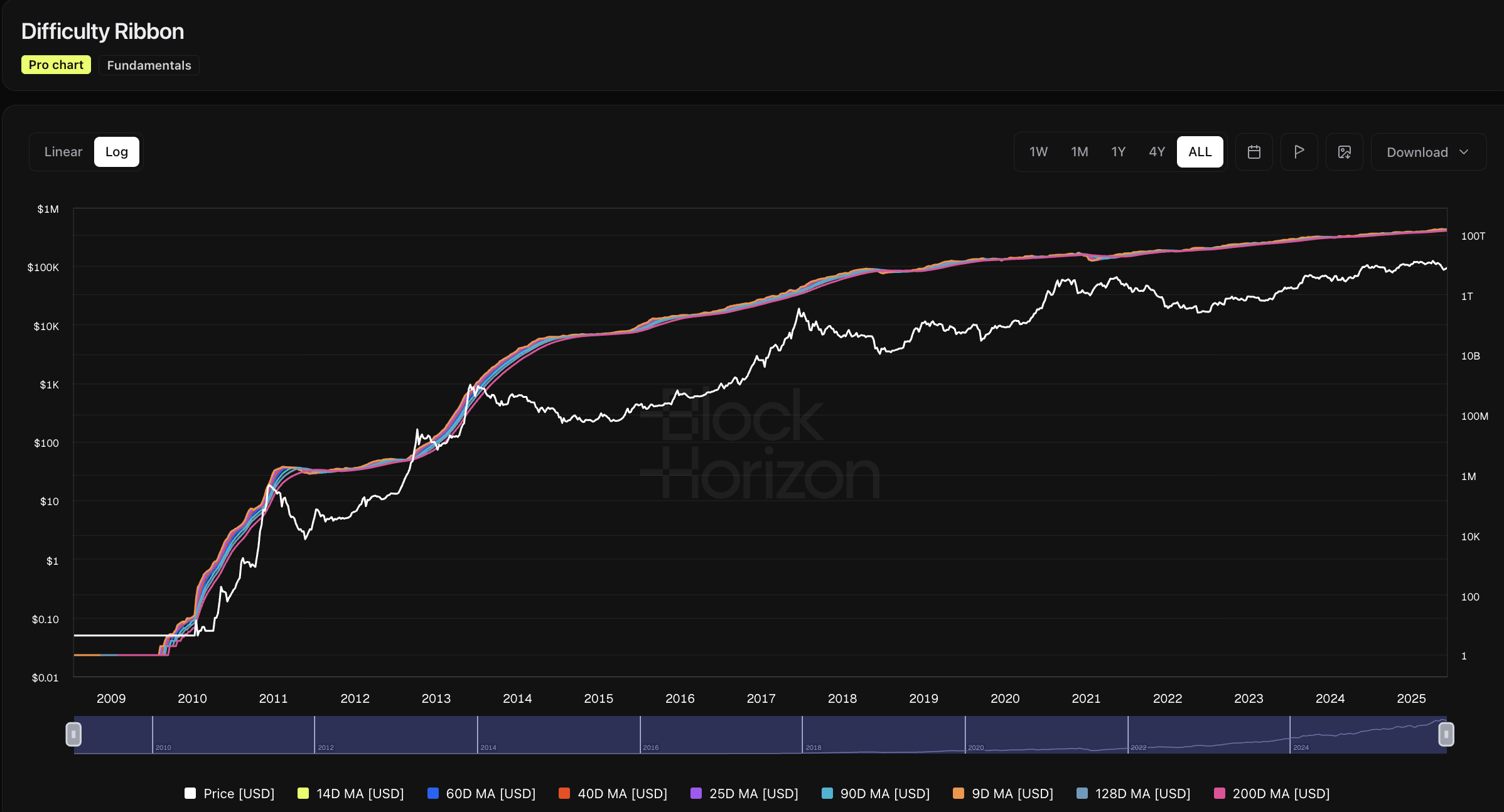
When the ribbon compresses, miners are under stress. When it expands, miners are recovering and reinvesting.
The result is a visual, intuitive way to understand Bitcoin’s economic foundation.
Let’s make this simple enough to explain in one breath:
The Difficulty Ribbon is a group of moving averages of Bitcoin’s mining difficulty. It helps you see whether miners are struggling, capitulating, or recovering.
Here’s what the moving averages represent:
When these averages cluster tightly, it means difficulty growth has slowed or reversed - often because miners are shutting off machines.
When they spread apart, it means difficulty is rising consistently - often because miners are adding hardware, increasing hash power, and becoming more profitable.
Miner behavior drives difficulty. Difficulty movement shapes the ribbon. The ribbon reveals the health of the mining ecosystem.
Bitcoin’s difficulty adjusts automatically every ~2 weeks, but the ribbon helps us see how miners are absorbing those adjustments.
Here’s why the indicator has become a favorite of long-term analysts and institutional researchers:
Think of the Difficulty Ribbon as a macro stress test happening in real time, silently tracking one of Bitcoin’s most important industries.
The ribbon is built from a series of difficulty moving averages (e.g., 9d, 14d, 25d, 40d, 60d).
Each line reflects a different “memory” of mining difficulty.
This creates a multi-layered signal of mining ecosystem health.
When the short-term difficulty averages drop toward the long-term ones, it indicates:
When difficulty resumes growth and short-term averages lift off from long-term ones, it signals:
This transition - compression → expansion - has historically mapped to Bitcoin’s most powerful long-term turning points.
You don’t need to be a miner or an engineer to read this chart effectively. Here’s the intuitive interpretation:
This is where the market “breaks” before it begins healing.
Historically appears early in bull cycles.
When the ribbon flips from compression to expansion, miners have bottomed out - and historically, that has aligned with major buying opportunities.
Compression is miner capitulation - but that phrase gets thrown around too casually, so let’s unpack it.
When miners capitulate, it means:
This creates short-term fear but long-term, it is one of Bitcoin’s healthiest resets.
Historically, ribbon compression has aligned with:
Is it a perfect timing tool? No. Nothing is. But as a signal of market cleansing, it’s one of the best.
When the ribbon expands, miners are reinvesting - which means they believe the worst is behind them.
Expansion typically reflects:
The key insight: Miners don’t expand during weak markets. They expand when they see opportunity.
This makes ribbon expansion one of the earliest confirmations of true recovery - long before sentiment shifts.
Across Bitcoin’s history, the Difficulty Ribbon has behaved with surprising consistency.
Compression has aligned with major bottom formations in multiple cycles. It didn’t give exact days - but it nailed the zones.
Expansion often occurs while disbelief is still high, marking the beginning of the “accumulation to uptrend” shift.
Around halvings, miner revenue is cut in half. This often creates short-term stress → compression → followed by expansion and bull markets.
During large price crashes or energy-price spikes, the ribbon tightens as stressed miners exit.
The Difficulty Ribbon reveals structural market behavior that price alone can’t show.
The ribbon isn’t a trading tool, it’s a macro intelligence tool.
Here’s how professionals use it:
Some analysts combine it with:
to build a complete picture of Bitcoin’s structural health.
No indicator is perfect - and the Difficulty Ribbon is no exception.
Here’s what it can’t tell you:
It’s also more reliable on Bitcoin than on smaller proof-of-work networks due to Bitcoin’s consistent mining environment.
Use the ribbon for context, not micro timing.
Want to get good at interpreting this chart? Start with these:
With practice, you’ll see the mining ecosystem with clarity most traders never reach.
It visualizes multiple moving averages of mining difficulty to reveal miner stress, capitulation, and recovery phases.
It signals miner capitulation, often aligning with deep market bottoms.
It indicates miner recovery and typically appears early in bull markets.
Not directly, but it reliably highlights stress and recovery phases that often precede major price trends.
No, but historically it has aligned closely with long-term accumulation zones.
Widely attributed to analyst Willy Woo.
It works best on Bitcoin due to its stable mining dynamics.
See miner capitulation and recovery trends in real time with BlockHorizon’s Difficulty Ribbon dashboard. Analyze compression, expansion, and long-term cycle patterns with research-grade clarity.