Powered by Block Horizon proprietary Bitcoin datasets.
If you’ve been around Bitcoin for more than five minutes, you’ve probably heard some version of:
“Yeah, we’re still down more than 70% from the top.”
That’s drawdown talk. Most people throw those numbers around without really understanding what they mean - or how powerful they are for reading Bitcoin’s cycles.
Price Drawdown from ATH looks almost boring as a chart. It’s just a line showing how far Bitcoin has fallen from its all-time high. But once you understand it, you get a clean view into:
how deep each bear market really was
when capitulation actually happened
how long recoveries take
where past cycle bottoms formed
It turns the chaos of price history into something structured and surprisingly easy to reason about.
And in this guide, we’re going to walk through drawdowns in a way that feels human, not academic.
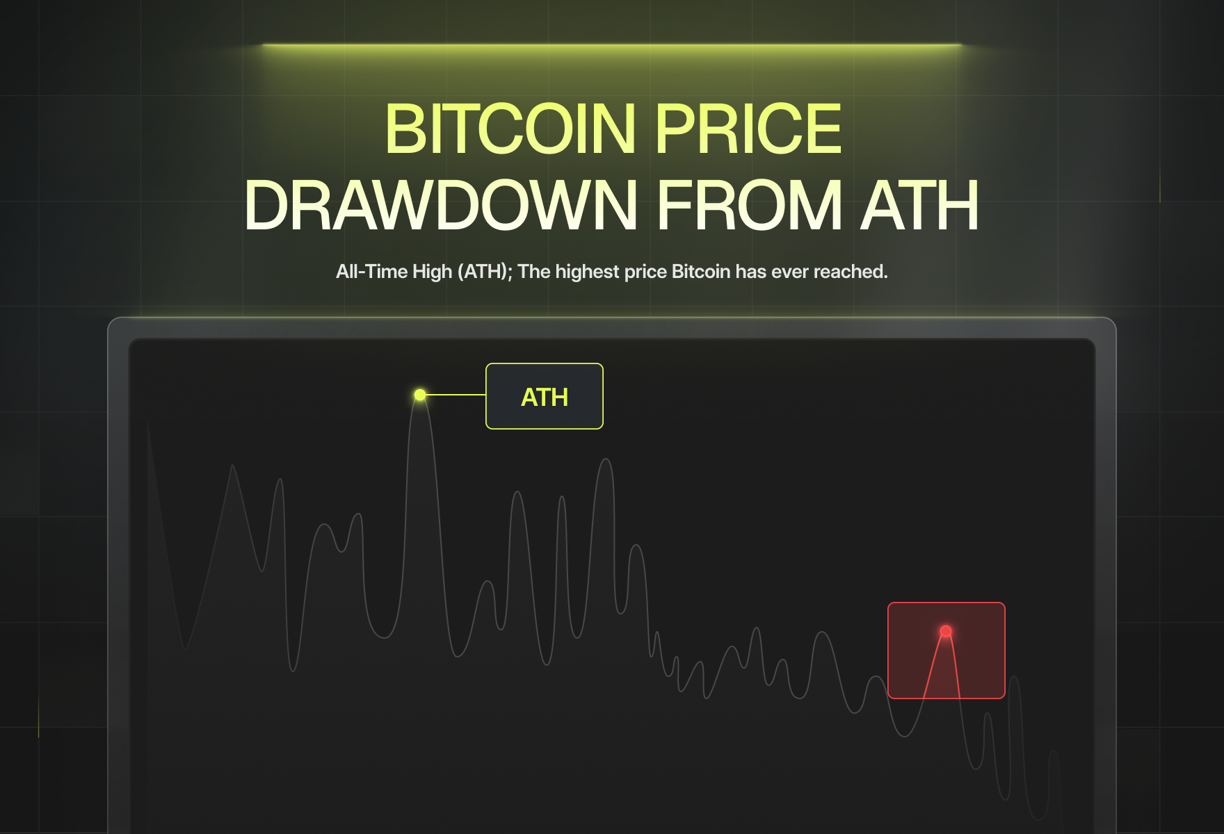
What Is Price Drawdown from ATH? (Simple Definition)
Let’s start with the basics.
All-Time High (ATH) The highest price Bitcoin has ever reached.
Drawdown from ATH How far the current price has fallen from that highest point, measured as a percentage.
If ATH is $69,000 and Bitcoin trades at $20,000:
Drawdown = (20,000 − 69,000) / 69,000 ≈ –71%
If Bitcoin later trades at $60,000:
Drawdown ≈ –13%
That’s it. No magic formula, no hidden complexity.
But this simple metric carries a lot of information:
how much pain the market has gone through
how far price has deviated from peak euphoria
where previous bottoms tend to cluster
Key idea: Drawdown is effectively a “pain index” for Bitcoin holders. The deeper it goes, the more fear and exhaustion you’re looking at.
Why Drawdown Works as a Cycle Indicator
Most charts show you absolute price. Drawdown flips the perspective and asks:
“Relative to the best things have ever been, how bad is it right now?”
That shift makes cycle structure much clearer.
Here’s why drawdown works so well:
It normalizes different cycles. A 2013 price drop and a 2022 price drop are hard to compare in dollars, but easy to compare as percentages.
It captures emotional stress. Being down 75% from the high feels very different from being down 15%. You don’t need a sentiment survey to know that.
It highlights true bear markets. –20% moves are noise for Bitcoin. –70%+ moves are structural.
It visualizes recovery. Watching drawdown go from –80% to –50% to –20% is a very different story than staring at price candles.
In other words, drawdown shows you the distance from euphoria - and that’s exactly what you want when you’re trying to understand bottoms, corrections, and recoveries.
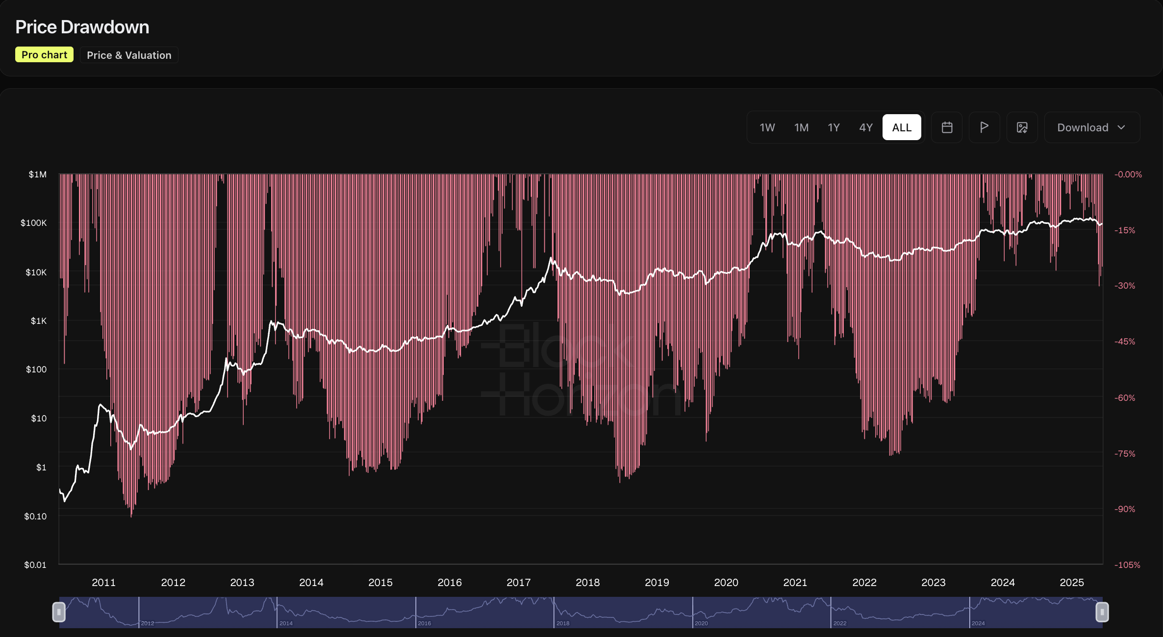
What the Bitcoin Drawdown Chart Actually Shows
When you open a Bitcoin Price Drawdown from ATH chart, here’s what you’re really looking at:
Current drawdown: How far today’s price is from the ATH.
Historical drawdowns by cycle: Every major crash from 2011 onward: how deep it went and how long it lasted.
Bear market durations: How many months Bitcoin spent in deep drawdown zones (–60% and below).
Recovery trajectories: How quickly Bitcoin climbed out of those deep zones and approached a new ATH.
Capitulation zones: Where the market experienced maximum pain and forced selling.
Long-term resilience: The simple fact that, so far, every brutal drawdown was followed by a new all-time high.
You’re not just seeing “we dropped 75%.” You’re seeing where that drop fits in the context of every other drop Bitcoin has ever had.
What Price Drawdown from ATH Measures
If we strip away jargon, drawdown tells you five core things:
How severe this correction really is: Is this just a pullback, or a full-blown bear market?
How quickly the sell-off happened: Steep, fast drops tell a different story than slow, grinding ones.
How exhausted investors are: Deep, prolonged drawdowns coincide with capitulation and apathy.
Where risk vs reward starts to flip: The deeper the drawdown, the better the long-term payoff has been historically.
How the current cycle compares to previous ones: Are we experiencing something completely new, or just another Bitcoin-sized storm?
For long-term investors, this is gold. It gives you context - and context is what keeps you from panic-selling at the worst possible time.
Why the Drawdown Indicator Matters for Bitcoin
You don’t need many indicators to understand Bitcoin. But you do need a few that actually work at the cycle level.
Drawdown is one of them.
Why it matters:
Bottom detection: Every major macro bottom so far has occurred in extremely deep drawdown (–70% to –85%).
Fear quantification: Drawdown visualizes collective pain without asking a single person how they “feel” about the market.
Risk management: It helps investors decide when to be cautious, and when deep fear has flipped the odds in their favor.
Accumulation planning: Long-term DCA strategies are far easier to design when you know where previous accumulation zones lived.
Cycle comparison: It lets you ask, “Is this drawdown milder, similar, or harsher than 2013, 2017, or 2022?”
The big insight:
Historically, the deeper the drawdown, the greater the long-term opportunity - if you can survive the emotional side of it.
How to Read the Drawdown Chart
Let’s turn this into something you can actually use.
When you look at a Bitcoin drawdown chart, you’ll see price deviations mostly falling into three broad ranges.
1. Large Drawdowns (–70% to –85%)
This is the deep end of the pool.
Historically associated with:
late-stage bear markets
capitulation and forced selling
long-term undervaluation
“Bitcoin is dead” headlines
investors who swear they’ll never touch crypto again
These zones have repeatedly marked the best long-term buying environments - not because the market immediately reverses, but because most of the damage has already been done.
2. Moderate Drawdowns (–20% to –50%)
These are the normal weather events of Bitcoin.
You’ll see them in:
strong bull markets (sharp corrections off local highs)
early recovery phases after brutal sell-offs
mid-cycle consolidations
They hurt, but they don’t typically destroy conviction the way –80% drawdowns do.
3. Minimal Drawdowns (0% to –10%)
This is where Bitcoin lives when:
it’s near all-time highs
trend followers are fully engaged
momentum is strong
optimism and greed dominate
Minimal drawdown doesn’t automatically mean a top is in, but it does mean the market is closer to euphoria than fear.
Historical Patterns in Bitcoin Drawdowns
Bitcoin isn’t perfectly cyclical, but it rhymes. Drawdown history makes that rhyme impossible to ignore.
A few highlights:
2011 Cycle
Wild early volatility
Massive drawdowns as the market tried to price a brand new asset
Deep crashes followed by equally aggressive recoveries
2013 Cycle
Two major blow-off tops
Two brutal crashes
Drawdowns that looked catastrophic at the time
In hindsight: early examples of Bitcoin’s boom–bust–recover pattern
2017 Cycle
Peak near $20,000
Followed by an –84% drawdown
Long, grinding bear market
Classic capitulation and apathy phase before the next run
2021–2022 Cycle
Double-top structure
An initial sharp correction, recovery, then a second leg down
Final drawdown around –77% from the $69,000 ATH
A more complex, multi-stage path to the bottom as institutions, leverage, and macro tightening all collided
Key takeaway: Drawdown depth and recovery speed change from cycle to cycle - but the emotional structure (euphoria → crash → despair → slow recovery) keeps repeating.
How Traders & Analysts Use Drawdown Data
Here’s how this chart actually gets used in the wild:
Identifying Accumulation Zones: Deep drawdowns are where long-term capital quietly steps in.
Quantifying Cycle Severity: Is this drawdown shallow, average, or among the worst we’ve seen?
Confirming Bottom Structures: When drawdown stops making new lows and starts contracting, it often signals early recovery.
Designing DCA Plans: Drawdown bands (e.g., –40%, –60%, –80%) make great reference points for staged buying.
Measuring Recovery Momentum: How quickly drawdown shrinks after a capitulation event tells you a lot about how much demand is returning.
Testing Macro Narratives: “This bear market is different” is a common line. Drawdown lets you check if that’s actually true.
For long-term analysts, drawdown isn’t a trading signal - it’s a context engine.
Limitations of the Drawdown Indicator
Time for some honesty: drawdown is powerful, but not magical.
Things it can’t do:
Predict the exact bottom
Guarantee that future drawdowns will match past depths
Tell you why price is falling (macro, regulation, exchange crises, etc.)
Replace on-chain fundamentals, supply metrics, or macro analysis
Adjust automatically for structural changes as Bitcoin matures
As adoption grows, institutions enter, and macro conditions shift, it’s entirely possible that future drawdowns will look different.
So treat this chart as one of your core tools, not the only one.
Pro Tips for Using Drawdown Analysis
If you want to go beyond “we’re down 60%” and actually use the chart intelligently, here are some practical ways to work with it:
Compare drawdown with realized metrics: Layer drawdown against Realized Price, 200WMA, NUPL (Capitulation Zone), or MVRV Z-Score for a more complete picture.
Watch for higher lows in drawdown: When each new drawdown trough is less severe than the last, it often signals that the market is quietly stabilizing.
Pay attention to the rate of change: Rapid contraction from –75% to –50% can signal the transition from despair to early optimism.
Set mental (or actual) thresholds: Historic bands like –40%, –60%, –80% are useful markers for planning entries, not exact triggers.
Use log-scale price charts alongside drawdown: This makes cross-cycle comparisons more honest and less skewed by nominal price.
The goal isn’t to “nail the bottom. " The goal is to understand where you are in the damage timeline.
FAQs
What is a Bitcoin drawdown?
It’s the percentage drop from Bitcoin’s all-time high to the current price.
What drawdown levels have historically signaled bottoms?
Past cycle lows have typically formed between –70% and –85% from the previous ATH.
What does a shrinking drawdown tell us?
It usually signals recovery - renewed demand, reduced forced selling, and the early stages of a new cycle.
Can future drawdowns be worse than past ones?
Yes. Nothing guarantees that future cycles will be milder or symmetrical.
Is the drawdown indicator predictive?
No. It doesn’t tell you what will happen next, but it does show when the market is historically stretched to extremes.
How often does Bitcoin reach a new ATH?
Roughly once per major cycle, after it has worked through a deep drawdown and full recovery phase.
TL;DR
The Price Drawdown from ATH Indicator measures how far Bitcoin has fallen from its highest price. It turns market pain into a simple, trackable metric.
Deep drawdowns (–70% to –85%) have historically aligned with bear market bottoms and long-term undervaluation.
Moderate drawdowns (–20% to –50%) are typical of bull market corrections and early recoveries.
Minimal drawdown (0% to –10%) appears near all-time highs in late-stage bull markets.
If you want to understand Bitcoin’s cycles, not just react to every candle, drawdown is one of the most reliable macro tools you can use.
Explore the Bitcoin Drawdown Chart
See the Bitcoin Price Drawdown from ATH chart on BlockHorizon and explore how current conditions compare to every past cycle.
Use it to understand where we are in the damage, the healing, and the next potential phase of the market.


.jpg)